































































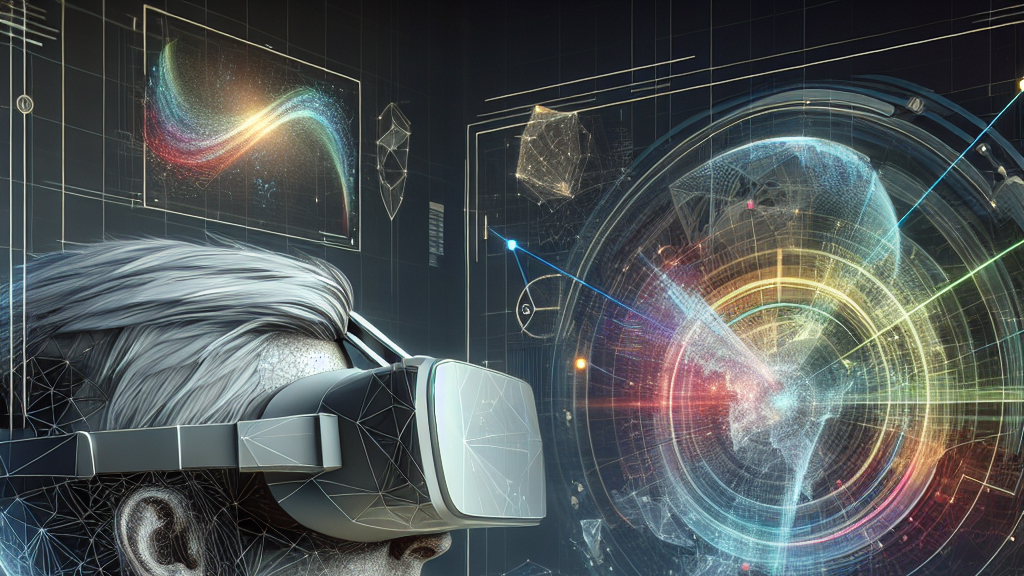
When you explore a virtual world, the way you look at things can change everything! Imagine staring at a complex 3D graph—what angle shows you the clearest picture? This research dives into precisely that question, discovering which angles people prefer when viewing 3D graphs in virtual reality. It’s like finding the sweet spot in a puzzle that makes all the pieces fit perfectly.
Researchers have explored how 23 participants interacted with 36 different 3D graphs in a virtual reality setup. The participants selected angles they liked and disliked, helping scientists understand what makes a viewpoint effective or preferable. By aligning these preferences with known aesthetic criteria, like minimizing crossings—where lines in the graph intersect—they’ve unraveled fascinating insights into what makes certain perspectives click.
Picture using this knowledge in designing interactive maps or educational tools—there’s a world of potential! Imagine customizing learning experiences or data analyses based on the best angles for human perception. This research opens doors to more intuitive, user-friendly technology in virtual reality, making data interpretation in 3D as easy as pie!
Did you know? The way we view a 3D object can completely change our understanding of its structure and relationships!
FAQs
What is the significance of 3D graph viewpoint selection in virtual reality?
Viewpoint selection in virtual reality directly impacts how users perceive and understand complex data, making it crucial for accurate interpretation of 3D graphs.
How was the user-preferred viewpoint study conducted for 3D graphs?
Researchers conducted a controlled study with 23 participants using virtual reality to select their most and least preferred viewpoints across 36 different 3D graphs, analyzing the results against aesthetic criteria.
What are the key indicators of preferred viewpoints in 3D graph visualization?
The study identified Stress, Crossings, Gabriel Ratio, Edge-Node Overlap, and Isometric Viewpoint Deviation as key indicators that influence user viewpoint preference in 3D graphs.
How can this research on 3D graph viewpoints benefit everyday technology?
This research can enhance user experience by influencing how interactive maps or educational tools are designed, making complex data more intuitive to understand in virtual reality environments.
What new measure was introduced in the study for 3D graphs?
The study introduced a novel measure called Isometric Viewpoint Deviation, which captures how well a viewpoint allows users to perceive a graph’s principal axes.
Background
Graph visualizations are a way to represent complex data, where the arrangement and appearance can dramatically influence understanding. In 3D visualizations, the perspective from which the data is viewed plays a crucial role due to its viewpoint-dependent nature. Immersive technologies like augmented and virtual reality present new ways to interact with these 3D graphs, but identifying optimal viewpoints remains challenging.
History
Visualization of data has evolved from simple 2D charts to complex 3D diagrams thanks to advances in technology. Earlier studies focused on aesthetic principles for 2D graphs and have now transitioned to understanding 3D environments, where immersive technology improves how we experience and interact with data. The current study builds on this by identifying user preferences for 3D graph viewpoints.
Based on “Show Me Your Best Side: Characteristics of User-Preferred Perspectives for 3D Graph Drawings” by Lucas Joos, Gavin J. Mooney, Maximilian T. Fischer, Daniel A. Keim, Falk Schreiber, Helen C. Purchase, Karsten Klein, available on arXiv (arxiv.org/abs/2506.09212), used under CC BY 4.0 (creativecommons.org/licenses/by/4.0/).

