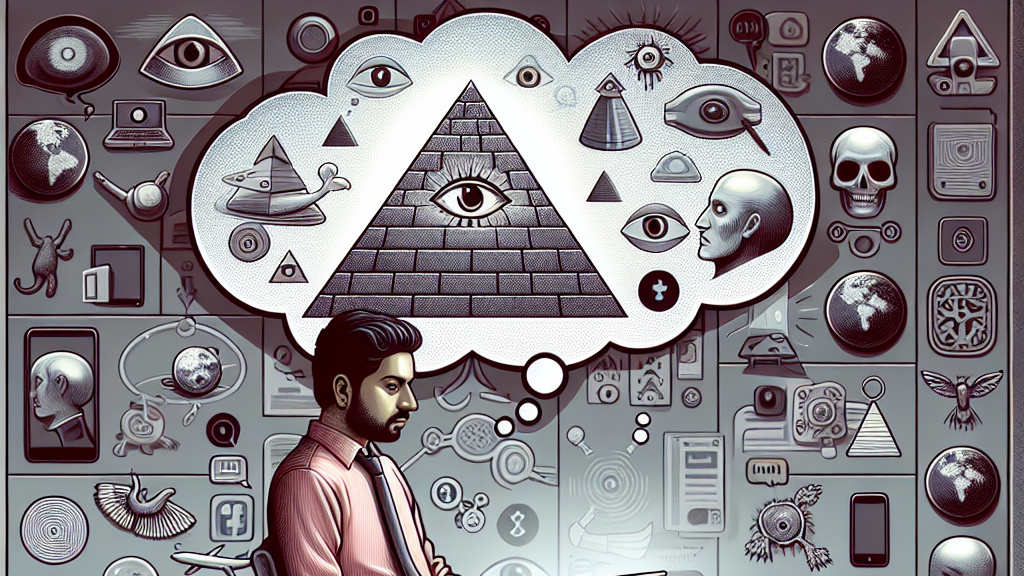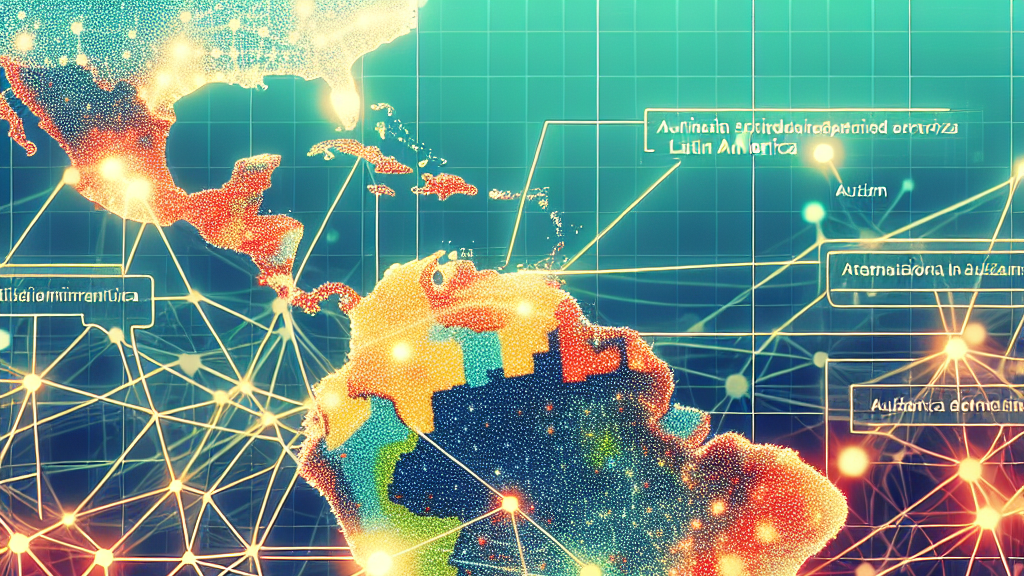


























































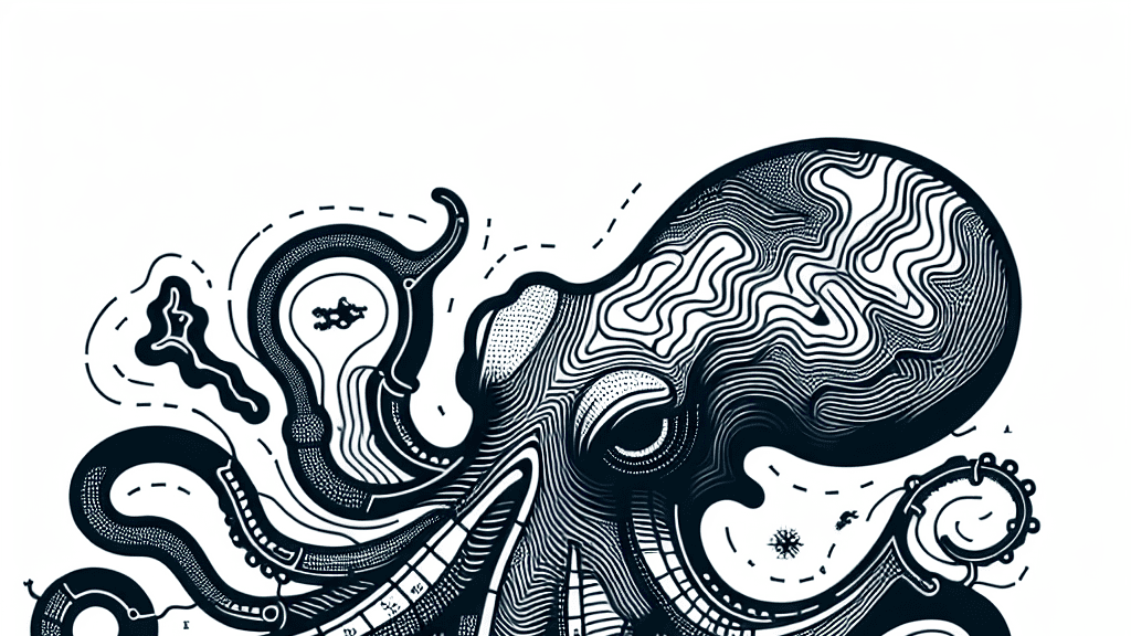
Have you ever looked at a map and felt like there was something deeper going on, like a shadowy force pulling the strings from behind the scenes? Welcome to the world of ‘octopus maps’! These aren’t your regular maps; they’re clever visual metaphors that link various issues to a central cause, like tentacles stemming from an octopus’s body. Historically, such visuals have been used to imply nefarious control by a group or nation, sometimes leading people down rabbit holes of conspiracy thinking.
In a fascinating study, researchers explored how these octopus maps actually shape our thoughts. By analyzing historical examples and running a crowd-sourced study, they found that certain features of these maps can prompt people to see connections that aren’t there, purely based on visual cues. The octopus imagery serves as an icon of control, and even without literal tentacles, some map designs can create a similar effect in our minds.
Imagine the possibilities—designing a map that could unintentionally spread false narratives or fuel suspicion! This study urges us to think about the ethics of data visualization and the responsibility of designers to create clear, honest images. As we navigate more complex global issues, understanding how visuals impact our thinking could help prevent misinformation from shaping our worldview.
Did you know that the octopus motif in maps has been used for over a century to symbolize control and manipulation?
FAQs
How do octopus maps influence conspiratorial thinking?
Octopus maps use visual metaphors to link various ideas or events to a central cause, making people perceive connections that are not really there. Their design can evoke an illusion of control by a particular force, leading to conspiracy-like interpretations.
Why is the octopus a common symbol in maps?
The octopus is often used in maps because its tentacles visually represent a central force reaching out to control different areas, making it an effective metaphor for manipulation or influence.
Can map designs impact our perception of data?
Absolutely! The study shows that the design and visual style of maps can skew our perception, leading us to see patterns or connections that are not actually present, which can contribute to misleading or conspiratorial thinking.
What can be done to prevent misuse of visual metaphors in maps?
Designers and mapmakers must be cautious about how they use visual metaphors, ensuring that their representations are clear and honest to avoid spreading misinformation or reinforcing harmful narratives.
How can understanding visual rhetoric improve data interpretation?
By being more aware of how visual cues affect our thinking, we can better interpret the information presented to us, reducing the risk of falling for misleading visual narratives and improving our critical analysis of data.
Background
The study of visual rhetoric examines how visuals can communicate specific ideas or arguments, much like language does. In the context of maps, especially those mimicking the octopus’s form, visual rhetoric explores how design choices can imply connections and control that might not exist. Understanding how these visuals impact human perception is crucial in an age where information can be easily misconstrued.
History
The octopus as a symbol of control on maps dates back to the 19th century, often used in political cartoons to symbolize imperial reach or dominance. Over time, this has evolved into a more sophisticated form of visual rhetoric in data visualization, where figures like octopuses subtly push narratives or ideas. Recent studies aim to dive into these implications and how they affect modern interpretation of data.
Based on “The Many Tendrils of the Octopus Map” by Eduardo Puerta, Shani Spivak, Michael Correll, available on arXiv (arxiv.org/abs/2501.14903), used under CC BY 4.0 (creativecommons.org/licenses/by/4.0/).